Telling the data story: How to create stories that matter
What is a data story and why are they important?
What is a data story?
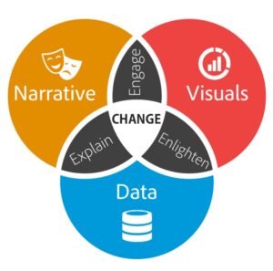
 What is a data story? One way to describe data storytelling is the ability to convey data not just in numbers or charts, but as a narrative that humans can comprehend. A data story is made up of three principal components – the data, the narrative and visualizations, which all work together to create a spoken or written account of the data that meets the information needs of your audience. The goal of a data story is to provide context to help explain the importance of the data and help communicate any key messages you are trying to relay through your data story. Powerful data storytellers are ones that know how to effectively reduce their findings down to a core set that gets the point across in the most direct and succinct manner.
Why tell a data story?
But why tell a story? Why not just show people numbers in a spreadsheet? Well, quite frankly it’s because stories are easier to remember. People relate to stories. And, truth be told, data stories are for the audience, not the author. Ever since humans first sat around a campfire, stories have been told to: Inform, to tell, update, provide facts; Persuade to sell, convince and recommend; Entertained to humor or amuse and touch our emotions. Overall when we want to tell a story, we don’t just want people to understand the data and/or information we are discussing. Using stories helps your main ideas stick.
Components of a data story
Earlier, we told you a data, story is spoken or written account of the data made up of a narrative and accompanied by visualizations. Here, we will break down exactly what we mean when we use the terms data, narrative and visualizations. Data are Statistics and information included in your data story to support your key message. The narrative is built around the data and includes other information used to tell the data story. It also provides context to help explain the importance of the data and the key messages you are telling through to your data story. And finally, visualizations are the tables, graphs, charts, maps, pictographs and other data visualizations you use in telling your data story. If done correctly, visualizations help your key messages “pop”.

